Thursday, July 31, 2014
Population Profile Graph
A population profile is simply a graph which depicts an average, or set age. Extending bars to the left and right of this preset value show the population value of people in this age group. Above is an example of a population profile of age groups and numbers of people with and without aids.
Index Value Plot
http://waterwatch.usgs.gov/new/?m=pa07d_dry&w=plot
Index value plots graph data on an X and Y axis. The information is displayed in a linear form, where a trendline or expected value line can or may not be met. This graph shows the expected rain for the time period shown, versus the actual recorded rain.
Index value plots graph data on an X and Y axis. The information is displayed in a linear form, where a trendline or expected value line can or may not be met. This graph shows the expected rain for the time period shown, versus the actual recorded rain.
Univariate
http://indiemapper.com/app/learnmore.php?l=bivariate_choropleth
Univariate maps display one variable of information, unlike bivariate maps. Univariate maps are often a type of choropleth map. This map is an example of of a univariate map.
Bivariate Map
http://reidarthur.ca/portfolio/
Bivariate maps are used to compare two different things or variables. In this bivariate map, is shows the comparison between crime and population rise.
Unclassed choropleth
http://garrisonsmapcatalog.blogspot.com/2011/11/unclassed-choropleth-map.html
Unclassified choropleth maps do not take an average value or "round" to a dominating factor. The scale for unclassed choropleth maps is gradual, allowing every shade of a color spectrum to have its own value.
Unclassified choropleth maps do not take an average value or "round" to a dominating factor. The scale for unclassed choropleth maps is gradual, allowing every shade of a color spectrum to have its own value.
Wednesday, July 30, 2014
Histogram
http://www.spcforexcel.com/histograms
A histogram is basically a bar graph. A histogram has a set of bars, each representing their own piece of data. There is an X axis and a Y axis. On the Y axis, the numerical value of the data is represented, while on the x axis the object being analyzed is placed. The histogram above represents a graph comparing frequency vs. measurement length.
A histogram is basically a bar graph. A histogram has a set of bars, each representing their own piece of data. There is an X axis and a Y axis. On the Y axis, the numerical value of the data is represented, while on the x axis the object being analyzed is placed. The histogram above represents a graph comparing frequency vs. measurement length.
Box plot
http://home.centurytel.net/~mjm/boxplotanatomy.htm
Box plots depict numerical data through sets of quartile blocks. Above shows a breakdown of how to read and interpret a box plot
Stem and Leaf
http://www.eduplace.com/math/mhm/5/06a/
Stem and Leaf plots are useful for plotting the frequency of different objects or pieces of data. They can be easily compared to one another by the length of the "leaf" extension. The above stem and leaf plot shows the ages of people at a family reunion and plots the number of people that are of that age in the leaf column.
Similarity Matrix
http://www.scielo.br/scielo.php?pid=S1415-47572003000100010&script=sci_arttext
A similarity matrix is ironically "similar" to a correlation matrix. In a similarity matrix, different sets of data interpreting different objects are compared and given a statistical value of similarity. The above image shows a similarity matrix for biological genomes.
A similarity matrix is ironically "similar" to a correlation matrix. In a similarity matrix, different sets of data interpreting different objects are compared and given a statistical value of similarity. The above image shows a similarity matrix for biological genomes.
Correlation Matrix
A correlation matrix is a plot of statistical data interpreted into a symmetrical square matrix, useful for comparing multiple objects data. It can be useful in the business world as a way to perform factor analysis. The above image is a correlation matrix plotting the ratings of different cars.
Star Plots
Star plots represent multiple variables of a single object or piece of data. The variables are represented through radii extending from the object of focus. Each radii's length represents the magnitude of its affect on the object of focus. The above image represents various crimes and the magnitude of their consequence.
DOQQ
http://fishermaniacsmaps.blogspot.com/2012_03_01_archive.html
DOQQ imaging uses aerial or satellite photographs and realigns the pixels in the image through a process called image rectification. The realignment of pixels is formulated into a specific ratio. In the map above of Louisianna, it is formulated into a 1:100000 grid.
DEM
DEM is a type of map that shows terrain of a landscape. Remote sensing is the most common way to obtain the imaging required for DEM mapping. It can be obtained via LIDAR and displayed often in a Raster format. Above is a DEM of New Mexico.
DLG
http://damonvanvoorhis.blogspot.com/2013_07_01_archive.html
DLG maps are collected from USGS maps. They are then converted to represent data, currently of which there are 9 different uses: PLSS, BD, TR, HY, HP, NV, SM, MS, and SC. They are then formatted for use in GIS systems. Above is an example of a DLG map.
DLG maps are collected from USGS maps. They are then converted to represent data, currently of which there are 9 different uses: PLSS, BD, TR, HY, HP, NV, SM, MS, and SC. They are then formatted for use in GIS systems. Above is an example of a DLG map.
DGR
http://egsc.usgs.gov/isb//pubs/factsheets/fs08801.html
DGR's or digital raster graphics, are scanned USGS topographic maps. These are often best used with integrated GIS systems as well as global positioning systems. This DGR shows the western section of Washington DC.
DGR's or digital raster graphics, are scanned USGS topographic maps. These are often best used with integrated GIS systems as well as global positioning systems. This DGR shows the western section of Washington DC.
Isopleth
http://www.nature.nps.gov/air/edu/lessons/figure3.cfm
Isopleth maps are useful to meteorologists. Isopleth maps use color codes with given values in a map key to depict a certain aspect of weather. They are often used in showing rainfall for a given time period as shown in the image above.
Isopach
http://cartographic-catalog.blogspot.com/2012/04/isopach-map.html
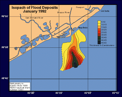
Isopach maps are useful for geologists. Isopach maps use contour lines representing areas of equal thickness, whether vertically or horizontally. Above is an example of an Isopach map showing flood patterns.
Isohyet
http://www.hko.gov.hk/wxinfo/pastwx/mws201206.htm
Another useful form of mapping for meteorologists is isohyets. Isohyets depict rainfaill by connecting points of similar amounts of rainfall over a given length of time. Above is an image of an isohyet for Hong Kong is 2012.
Isotach
Isobar
http://theweatherwiz.com/school/chpt2a.htm
Isobars are useful in meteorology. They work similar to contour lines though rather depicting elevation change, they represent changes in atmospheric pressure. Above is an example of an isobar depicting a high pressure weather system.
LIDAR
http://www.kval.com/news/local/102918079.html
LIDAR uses light to remotely sense and determine distance of an object, this is often done using laser. It is useful in contour mapping to a great deal of precision. Some satellites integrate this technology into their systems. LIDAR has many uses, one great example is the ability to determine the biomass of a given area for environmental purposes. The image above is showing how LIDAR is used to boost the ecosystem of this area by determining its vegetation density.
Doppler Radar
http://cimss.ssec.wisc.edu/oakfield/radar.htm
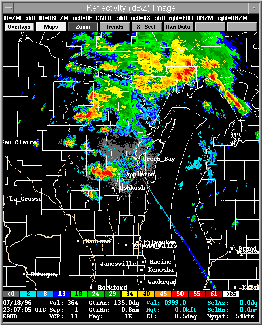
Doppler radar uses radio waves to determine the distance and velocity of an object. Doppler is especially useful in determining weather patterns. The image above is a doppler radar image showing the formation of a tornado.
Black and white Aerial photo
http://www.mapmart.com/Products/AerialPhotography/geoORTHO.aspx
Black and White Aerial photos are computer generated images of an original photograph. They are particularly useful in removing relief, allowing an easier depiction of pathways (ie: roads), or other features of distinguished contrast. Notice in the image provided, the clarity of the roadways being shown.
Aerial Infrared
http://www.geospectra.net/lewis_cl/knife_riv/k_river.htm
Aerial infrared photos are photographs taken using an infrared camera. The aerial shots can be taken from satellite or from a airplane or helicopter. This image depicts vegetation in a landscape, the brighter colored infrared represents lively vegetation.
Aerial infrared photos are photographs taken using an infrared camera. The aerial shots can be taken from satellite or from a airplane or helicopter. This image depicts vegetation in a landscape, the brighter colored infrared represents lively vegetation.
Cartographic Animations
http://geocurrents.info/cultural-geography/linguistic-geography/quentin-atkinsons-nonsensical-maps-of-indo-european-expansion
Cartographic animations are implemented using GIS. Cartographic animations allow the user to become more immersed in the map itself, by creating realistic digital effects. A good example of this could be a projected hurricane path, which most of us have probably seen. This image is a still frame of a cartographic animation that shows the movement of the Indo-European language.
Statistical Maps
http://polisci.emory.edu/home/graduate/methodstraining.html
Statistical maps are any kind of map which depicts a certain statistic. A good example of one is a dot density map. This map depicts micro vs metropolitan statistics in the United States.
Cartogram
http://www.ncgia.ucsb.edu/projects/Cartogram_Central/types.html
A Cartogram is a type of map that represents data by skewing the actual landscape of the map. For example, a map depicting population over an area, may skew the areas of higher population to a larger proportion in comparison to its actual scaled size. Here is an example of a cartogram representing populations in California.
A Cartogram is a type of map that represents data by skewing the actual landscape of the map. For example, a map depicting population over an area, may skew the areas of higher population to a larger proportion in comparison to its actual scaled size. Here is an example of a cartogram representing populations in California.
Flow Map
http://www.valuecreationpartners.com/2012/02/macro-level-process-map/
Flow maps depict the movement of a certain object or piece of data. A Flow map integrates charted data, with geographical mapping. Though a flow map does not necessarily have to contain any geographical information. A good example of a flow map or chart is the one provided, it provides the movement of a good in a linear flowing chart.
Isoline map
http://regentsprep.org/Regents/earthsci/units/mapping/topographic.cfm
Isoline maps depict information by connecting dots on the map which have the same value. This map in particular connects all of the gasoline fields with a value of 40 together.
Isoline maps depict information by connecting dots on the map which have the same value. This map in particular connects all of the gasoline fields with a value of 40 together.
Proportional circle map
http://personal.frostburg.edu/sbriggs0/maps.htm
Proportional circle maps are similar to dot density maps. The main distinguishing feature of a proportional circle map is the variability in the size of each circle. Depending on the key provided for a given map, each circle size depicts a value. This proportional circle map depicts the number of walmarts in a state, the largest circles represent 100 walmarts!
Choropleth Map
Choropleth maps are a type of thematic map. Choropleth maps focus on showing variability in different regions, often represented through color. They are particularly useful in depicting varying data over a landscape. This choropleth map shows Hispanic population throughout Florida, the key shows the percent that each color represents.
Dot Distribution Maps
Dot distribution maps use dots to represent a certain value. The dots can be assigned a value (ie: 1 dot=1000 people). This image shows a dot density map representing where FeederWatcher participants lived, by placing a dot on their home location.
Propaganda Map
http://durrutilog.blogspot.com/2010/08/nostalgia.html
Propaganda maps are maps that are meant to be persuasive. Some of the best examples of propaganda map can be seen during world war 2. This example of a propaganda map portrays Portugal's small size in comparison to the US, though notice it does not address military powers or population, simply land mass.
Hypsometric Map
http://www.izera-darksky.eu/izera/izera-en.html
Hypsometric maps are similar to topographic maps. The key distinction of a hypsometric map is the use of color to represent relief of a landscape. Though similar to topographic maps, hypsometric maps can also contain contour lines to represent elevation changes. This map represents the Izera-Dark Sky Park. The shade changes are called hypsometric tint, and they represent changes in elevation.
Hypsometric maps are similar to topographic maps. The key distinction of a hypsometric map is the use of color to represent relief of a landscape. Though similar to topographic maps, hypsometric maps can also contain contour lines to represent elevation changes. This map represents the Izera-Dark Sky Park. The shade changes are called hypsometric tint, and they represent changes in elevation.
PLSS maps
http://nationalatlas.gov/articles/boundaries/a_plss.html
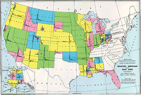
PLSS or "Public Land Survey System" is a map which depicts government ownership of certain lands. . PLSS maps divide land principal meridians and base lines, and divide it even further into subdivisions called townships. This map represents the Principal meridians and Base lines of the US as surveyed by the Bureau of Land Management.
PLSS or "Public Land Survey System" is a map which depicts government ownership of certain lands. . PLSS maps divide land principal meridians and base lines, and divide it even further into subdivisions called townships. This map represents the Principal meridians and Base lines of the US as surveyed by the Bureau of Land Management.
Cadastral Map
http://www.dimensionicad.com/india/cad-parcel-mapping.html
Cadastral maps are useful in mapping real estate. It can be used to show an areas metes and bounds in respect to real estate. These sorts of maps are particularly useful to real estate companies or advertising agencies. GIS is used to create many of these maps. This cadstral map depicts real estate ownership in subdivisions of different color.
Cadastral maps are useful in mapping real estate. It can be used to show an areas metes and bounds in respect to real estate. These sorts of maps are particularly useful to real estate companies or advertising agencies. GIS is used to create many of these maps. This cadstral map depicts real estate ownership in subdivisions of different color.
Thematic Map
A thematic map is a map that focuses on a particular "theme". A thematic map can focus on almost anything that the cartographer is attempting to portray, an example could be states which a certain political party has won. Often thematic maps are portrayed in color, each color representing a certain topic or value. Thematic maps can also contain dots to make its representation. This map in particular represents population change over a period of time by using a color coded key. (ie: dark red = 20.8% populated to 191%).
Topographic map
Topographic maps focus on representation of elevations in a landscape. Most maps use contour lines, which include a scaled distance between each line to interpret the level of slope. With modern technology, and digital mapping, topographic maps can represent relief in a much more aesthetic way. This map shows Ruth Creek Mountain in Washington. Contour lines are used to represent elevated changes, as well as color and shading to depict mountainous landscapes.
Planimetric Map
A planimetric map is a map that shows strictly a horizontal view of a landscape, topography is not included in these kinds of maps though elevation can be represented. In this map for example, the lines on the edge of the gully depict a "steep slope". This is a planimetric map of "Last Day Gully" in Wyoming. Included in it is a scale, depicting an accurate scalar distance.
Mental Map

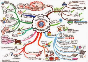
This is a mental map. A mental map is explanatory in its own name, it is simply a map that an individual creates from their own memory or thought. This example of a mental map is portraying a person's ideas to solving the "global warming" crisis. This map qualifies as a "mental map" because it is portraying a person's own thoughts in a way that this person sees fit to clear understanding.
Subscribe to:
Comments (Atom)


