Friday, August 1, 2014

Resource Maps


http://www.farmland.org/resources/fote/states/map_texas.asp

Resource maps can be made from many different map types.  They can integrate anything from topographic map features, to classed choropleth integrations.  Resource maps do exactly as they are named, they map resources in a given area.  Above is a resource map of Texas.

Road Maps

http://england-map1.com/508661.html

Road maps have been very useful in the past.  However, with increasing use of GPS systems, which can now be integrated into cars, the use of a road map is diminishing.  Above is a great example of the detail and precision of a roadmap of London.

Parallel Coordinate graph


http://andrewgelman.com/2007/10/15/parallel_coordi/
A parallel coordinate graph is usually displayed in a 3d computer generated graph.  It compares two sets of data, and joins them on a linear plane.  The graph is constructed on an X and a Y axis.  Above is a good example of a parallel coordinate graph.

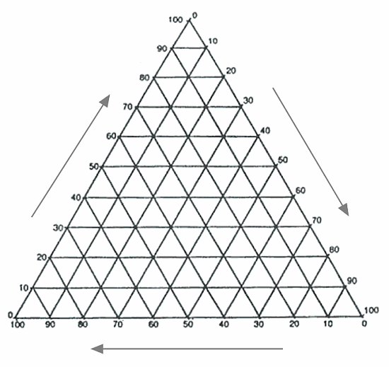
Triangle Plot


http://geographyfieldwork.com/TriangularGraph.htm
Triangle plots compare three separate variables, which value equals the total sum of a constant.  These are often useful in chemistry, as to find a certain rate constant of a compound.  Above is an example of a triangle plot.

Windrose

http://sustainabilityworkshop.autodesk.com/buildings/ecotect-vasari-climate-analysis

Wind rose graphs are used by meteorologists to display wind pattern and wind strength of a particular area.  The wind rose dats back historically and at one point was used on virtually all maps as a combination of a compass and a wind pattern predictor.  Above is an example of a windrose graph.

climograph

http://www.oocities.org/sg/c_pling/climates.html

A climograph is a representation of climate parameters.  They contain an X and Y axis, and are implemented using the standards of a bar and a line graph.  Above in an example of a climograph for Iquiotos, Peru.

Accumulative line graph

http://www.fhwa.dot.gov/publications/research/safety/08070/

An accumulative line graphs contain an X and a Y axis.  A line represents the change over time(x axis) while the Y is the variable of which is fluctuating.  Above is a good example of a cumulative line graph.